In a nutshell
- 🎨 The hack is color drenching: carrying one hue across walls, trim, doors, and the fifth wall (ceiling) to erase visual breaks so spaces feel calmer and often larger.
- 🧠 It works by reducing edge contrast; the eye reads continuity, not confinement. Considering a color’s Light Reflectance Value (LRV) and using layered lighting refines mood and balance.
- 🛠️ Practical steps: test sample pots, vary finishes (matte walls, satin/eggshell trim), prime glossy woodwork, and paint radiators, sockets, and vents to avoid distracting “dots.”
- 💷 Budget/rental tactics: use removable panels, upcycle furniture in the room tone, add simple beading painted the same color for “architecture,” and prioritise unified trims over white skirtings.
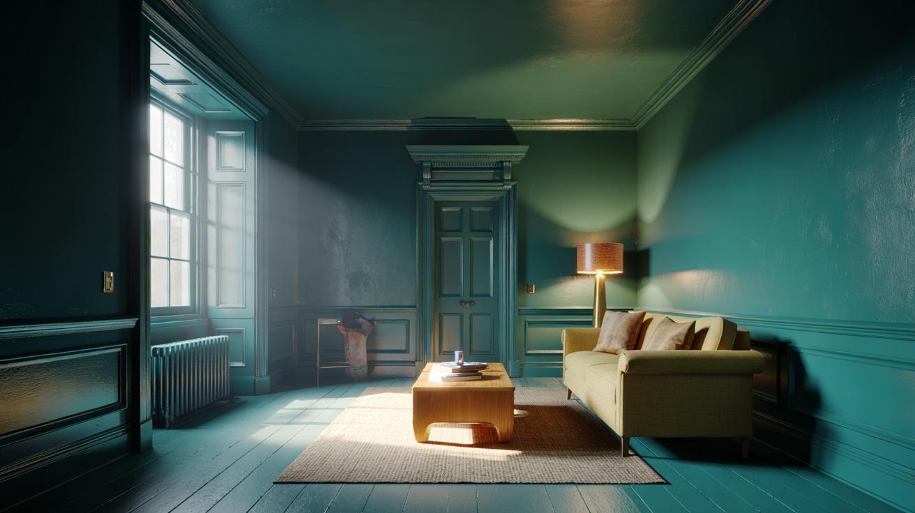
- 🏠 Real-room wins: a smoky green box-room office becomes a focused cocoon; a Victorian lounge in soft plaster pink unifies cornice and ceiling—including the ceiling is the game-changer.
The latest interiors trend with real staying power isn’t a pricey sofa or a complicated renovation. It’s a clever paint strategy that designers across the UK are quietly using to change how rooms feel, function, and photograph. The hack is called color drenching: carrying one hue across walls, skirting, doors, architraves, even the ceiling. By erasing visual breaks, it recalibrates scale, softens awkward angles, and turns poky spaces into cocooning sanctuaries. Because the eye stops hopping between contrasts, the room reads as calmer and often larger. Best of all, it can be done over a weekend with thoughtful prep and a single, well-chosen shade.
What Designers Mean by “Color Drenching”
Color drenching means committing to one dominant hue and extending it over almost every painted surface, including the often-forgotten fifth wall—the ceiling. Instead of crisp white trims cutting the room into bands, you create visual coherence. Architectural quirks blend rather than shout, radiators retreat, and doors feel integrated. One color, varied subtly by sheen, produces depth without clutter. Designers aren’t trying to make spaces darker; they’re unifying them so furnishings, art, and texture can take the spotlight.
The method is surprisingly flexible. Deep greens and blues deliver enveloping calm in bedrooms and snugs; warm clays and taupes bring hospitality to dining rooms; pale stony neutrals freshen compact hallways. The trick is not purity but nuance: pairing the same color across multiple finishes—matte on walls, satin on trim—adds movement while keeping a single, soothing read. For period homes with patchwork additions, this uniformity ties eras together without erasing character.
Why It Works: Psychology, Light, and Proportions
Human vision hunts for edges. High-contrast junctions—white ceiling against colored wall, bright skirting under darker paint—create hard horizons that can flatten height and shorten walls. Eliminating visual breaks tricks the eye into reading continuity, not confinement. With color drenching, corners melt, angles recede, and proportions feel corrected. Low ceilings seem to lift when the ceiling joins the party; narrow rooms feel broader when skirtings no longer slice the bottom line.
Light behaviour matters too. A color’s Light Reflectance Value (LRV) indicates how much light it bounces. Mid-LRV shades often excel here: they soften glare in south-facing rooms and warm up grey northern light common in UK homes. Uniform color reduces patchy reflectance that otherwise emphasises blemishes. Consistency tames shadows, so the atmosphere feels intentional rather than accidental. Pairing the scheme with layered lighting—wall washers, table lamps, dimmable LEDs—keeps the mood adjustable from work-bright to evening-soft without fighting conflicting paint bands.
Step-by-Step: Drench a Room Without Regret
Start with three to five sample pots in your target family. Paint large boards and move them around through the day. Choose finishes by function: durable eggshell or satin for skirting and doors, wipeable matte for walls, ultra-flat for ceilings. Prime gloss trims so the new hue grips. Include doors, window frames, and radiators in the plan—when they match, they visually disappear. Don’t skip sockets and vent covers; a quick spray or brush in the same tone prevents noisy dots.
| Element | Recommended Finish | Practical Tip |
|---|---|---|
| Walls | Wipeable matte | Roll top-to-bottom to avoid lap marks in low light. |
| Trim & Doors | Eggshell or satin | Sand lightly; one-tint darker for subtle depth. |
| Ceiling | Ultra-flat | Cut in twice; bright bulbs will reveal misses. |
| Radiators | Heat-resistant satin | Use a mini foam roller for a factory-like finish. |
If you rent, try removable mural panels or color-matched fabric panels mounted on battens, and paint only furniture plus a single statement wall and woodwork. Commit to the ceiling, even in a pale tint—this is the lever that changes the room’s geometry. Finish by reintroducing texture: linen, timber, brass, and chunky rugs prevent flatness and make the monochrome scheme feel layered.
Real-World Scenarios and Budget-Savvy Swaps
Small box room turned office: choose a mid-tone smoky green with low LRV. Drench everything, then add a pale oak desk and a rattan shade for lift. The boundaries retreat; the room becomes a focused cocoon ideal for calls. Victorian lounge with tall ceilings: drench in a soft plaster pink; keep the same hue on cornice and ceiling to emphasise volume. Period details remain, but the eye reads elegance instead of interruptions.
On a tight budget, skip panelling and get architectural “weight” by painting simple beading strips in the same color to form frames. Upcycle second-hand furniture in the room tone for cohesion. If you fear darkness, choose a stony white with a touch of green or red oxide; the undertone warms shadows. Avoid the common mistake of leaving skirtings bright white—this cuts the room at the ankles. Unified trims are where the magic happens, not just the walls.
Color drenching isn’t a gimmick; it’s a practical way to correct proportions, soothe busy layouts, and foreground texture without buying a new suite of furniture. By choosing one hue and flexing sheen and lighting, you can dial a space from airy to intimate with surprising control. The ceiling is your secret accelerator—include it, and the transformation feels architectural. If your room had a voice, what shade would it choose to speak in, and which surfaces would you drench first to change the story most dramatically?
Did you like it?4.4/5 (22)